Jun 222011
 

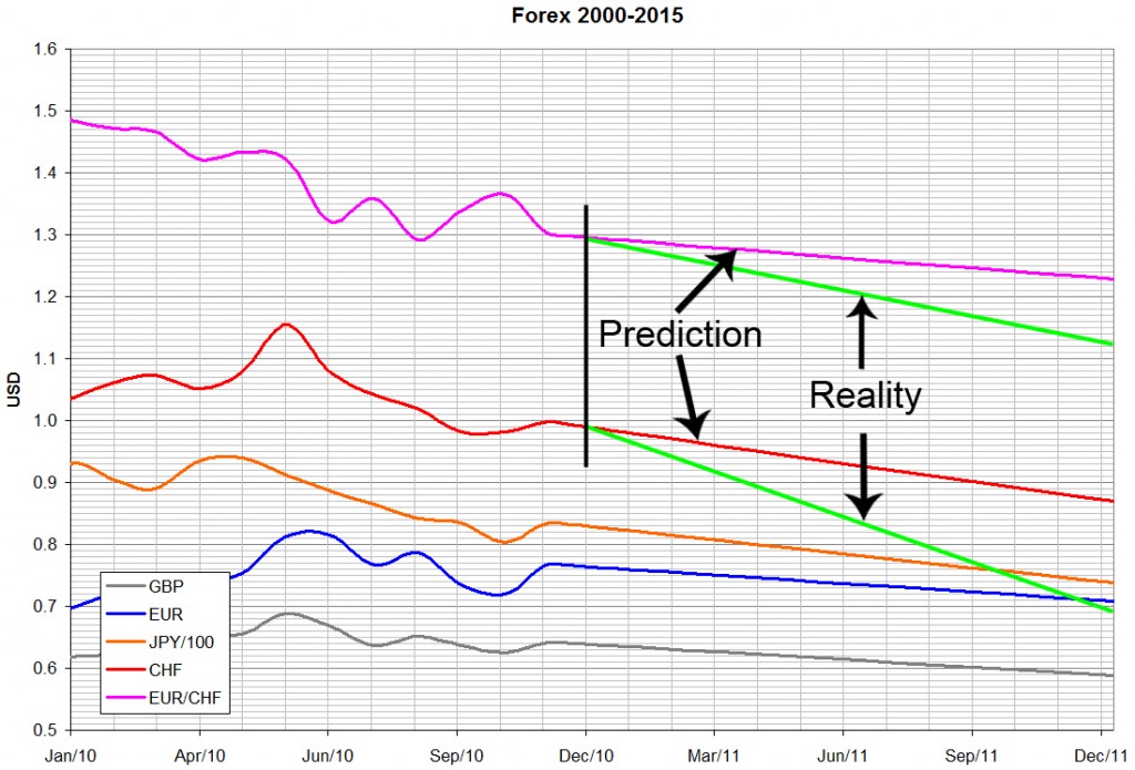
Just before Christmas 2010 I gave my yearly prediction as to how I saw the forex market evolving.
Those that read it heaped ridicule on me: “the dollar couldn’t devalue, it’s unthinkable, it’s the world’s reserve currency, you’re crazy”, “the Euro could never fall like that”.

Six months down the road, let’s take a look at how things really turned out.
The red line (USD) and pink line (EUR) are those I drew last Christmas, the green ones are the current situation on the 22nd of June 2011 (1 CHF=0.8360 USD = 1.2030 EUR):

The figures speak for themselves.

Jun 182011
 

The media are once again obsessing about the economy, or more accurately the lack thereof, to a back-drop of procrastinating politicians who are no more qualified to administer public finances than chimps are to perform brain surgery.

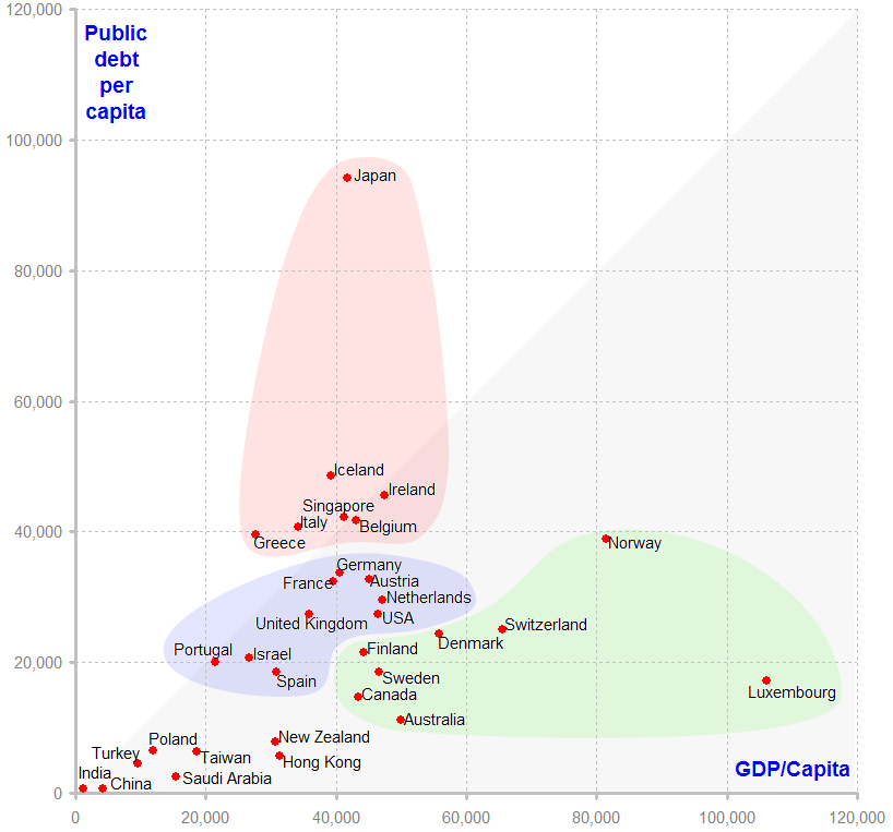
Everyone seems to accept that a country’s economy shall be measured by the ratio of its public debt to its GDP. I question this, on the grounds that whilst America’s 8.5 trillion dollars is a lot of debt, it represents about 27’000 per inhabitant, which doesn’t really sound that bad. The Icelandic 15 billion dollar debt pales in comparison, but per inhabitant it’s 47’000, which is nearly double that if the USA.

Here’s the Public Debt versus GDP for a cherry-picked set of countries, essentially the developed and significant nations:

The numbers are in USD, source CIA Factbook, IMF and World Bank, in this spreadsheet PublicFinances.xls. The horizontal scale shows productivity, the vertical scale measures indebtedness. The grey triangle encompasses those countries whose public debt is less than a year’s GDP.

There are three coloured clusters, which group those who have similar economic habits.

  1. The Spendthrifts, with debt exceeding GDP. Japan has been trying to kick-start its economy for over a decade, it clearly hasn’t worked. That Iceland, Ireland and Greece are heavily in debt is hardly a surprise, but I didn’t expect Belgium and Singapore to be here.
  2. The Western Norm, with debt between 50% and 100% of GDP. Essentially the rest of Europe and the USA. Israel’s economic habits, predictably, are the same.
  3. The Cautious, with debt less than 50% of GDP. Here we have the Nordic countries, the true bankers and unexpectedly, Canada and Australia.

The others make for a few interesting observations.

China and India, regularly upheld as models of economic development, are still in abject poverty at the individual’s level. When average inhabitant generates 4$/day (India) or even 19$/day (China), even a homoeopathic increase in employment will give you 10% growth a year; certainly not a notable achievement. To put that into perspective, if China’s GDP increases by 10% (compounded) every year, it’ll reach Germany’s current productivity in 2035. I’m not holding my breath.

Despite their immense income from oil, the average Saudi’s income is barely a third that of an Irishman (but the Irishman has twenty times the debt).

Finally, for all the current fretting over the American debt, it’s comparatively modest in relation to the population. The Greek and Irish economies are getting lots of publicity, but there are others whose public finances are much worse. Italy, Belgium, Iceland and above all Japan are going to have a much rougher time putting their houses in order.

May 292011
 

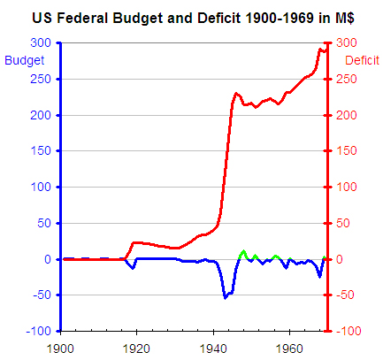
The Democrats and Republicans are slogging it out, trying to find a way to reduce the US debt. A laudable effort, but frankly, it’s pissing in the ocean. To see the big picture, we’ll take a look how the US government has been running its shop over the last century or so. Take the first half of that period, up until 1970, when the gold standard was abandoned. Notice that all numbers are in millions of dollars:

The second World War made a nasty dent in the finances, but that’s perfectly understandable. I’ve shaded the years where the books showed a ‘profit’ in green; there are precious few and the amounts are insignificant.

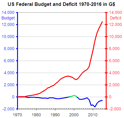
Since 1970, the picture changes drastically, we have to multiply the scale by a factor of 50’000; we’ve moved from millions to billions:

You might notice, correctly, that the debt in 2011 is shown around 9.6 trillion, when it is in fact 14.3 trillion. Presumably there’s another 5 trillion that was borrowed somewhere; a trifle that we’ll ignore.

The message to take away here is that the US government has balanced its books in 4 years out of the last 40. Perhaps more telling is that those 4 rare years are thanks solely to the dotcom bubble and the true value is directly correlated to the main thing it generated: hype.

The average American thus owes some 47’000$ on behalf of his government (and an average of 7’000$ on his credit card, but that’s another story).

Put in household terms, this is like earning 100’000 a year, spending 176’000 and borrowing a further 19’742 to pay the interest on the 657’864 that you borrowed in previous years.

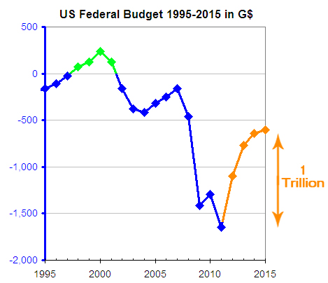
Let’s zoom in on how the White House sees that debt evolving:

The dotcom money is put into perspective and we get to the part where I’m asking myself who’s been smoking something dubious. Remember, these are the numbers I obtained from the White House, which predicts that the debt will be reduced by 1’000’000’000’000$ in the next 4 years.

Thus, every American man, woman and child is going to reduce spending by 833$ every year, not to eliminate the debt, but simply to halve the yearly budget deficit.

The Americans are definitely in the shit; but the shit they’re in isn’t the shit that they’ve been smoking.

May 102011
 

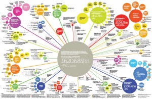
Pavel in St. Petersburg asked me if it would be possible to produce bubble diagrams like this in Excel:

UK Public Spending

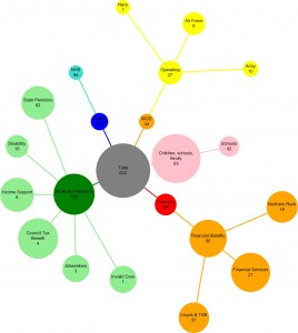
Excel has had bubble diagrams sine 2003 but they are just an X-Y plot with variable-sized nodes. What Pavel was after is an automatic layout, with lines joining the nodes, along these lines:

Bubble diagram with Graphviz

Not perfect, but you get the idea, and it’s produced automatically. To do this, you’ll need Excel, Visio, Graphvizio and this zip file which contains the sample XLS, GV, VSD and JPG files.

  • Open the XLS. Column A is the node’s title, B is the title and the amount separated by a newline. Columns C, D and E specify the node’s parent, colour and amount. Column F computes the diameter of the node, in inches, from the amount:

Column G just creates Graphviz DOT statements from the values. G1 and G2 are the prelude. Copying column G into a text file called bubble1.gv, we get:

graph  RootGraph {
node [fontname=Arial, fontsize=12, style=filled];

"Total\n620" [width="3.1", height="3.1", color="gray", fillcolor="gray", shape=circle];

"Children, schools, family\n63"--"Total\n620" [color="pink"]; "Children, schools, family\n63" [width="0.315", height="0.315", color="pink", fillcolor="pink", shape=circle];

"Schools\n42"--"Children, schools, family\n63" [color="pink"]; "Schools\n42" [width="0.21", height="0.21", color="pink", fillcolor="pink", shape=circle];

...snip...

}

  • Fire up Visio. Graph>Diagram->Import Graphviz
  • To get the circular layout, Graph->Settings->Diagram->Concentric
  • Graph->Layout
  • A little tweaking of the font sizes and line thickness and you’re on your way

Enjoy!

Mar 192011
 

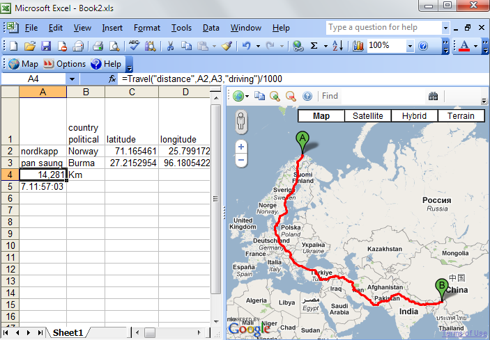
You have to hand it to Google’s engineers, even the best GPS will have a hard job beating this: driving directions from Nordkapp in Norway to Pan Saung in Myanmar (Burma). 14’281 kilometres will take just over a week of continuous driving:

How did I do this in Excel? GeodesiX

 Posted by at 12:28 am  Tagged with:
Jan 082011
 

For those who envisage building an Excel RTD server, I have written a tutorial and open-sourced the code on SourceForge.

The following topics are covered:

  • How RTD servers work
  • Architecture
  • Excel, Multithreading and callbacks
  • Providing easy-to-read function names
  • Talking to the GoogleMaps APIs
  • Avoiding Application Domain misery
  • Embedding a GoogleMap page in an Excel Task Pane
  • Creating the Setup project
  • Changing the Excel RTD Throttle Interval
  • Utility functions
  • Building help from the source with Sandcastle

I hope that you will find it useful.

Dec 212010
 

A year ago I wrote an article predicting that the US dollar would be worthless, against the Swiss Franc and the Japanese Yen, by around 2020. A year has passed and the US dollar has been falling in line with my prediction, so I felt it might be interesting to re-visit the subject with a slightly different tack. Also, today seems like an auspicious date for doomsday predictions.

Rather than dealing with absolute exchange rates, I set out to try and show the relative strengths of currencies amongst themselves. To illustrate, let’s suppose that a glass of wine costs 5 USD.

  • On day one, we buy a 100mL glass with a dollar’s worth each of USD, GBP, EUR, JPY and CHF.
  • A month later, we need a refill. The wine still has the same value, but the exchange rates have changed.
  • Suppose GBP has risen by X% (and nothing else has changed). As we’re buying the wine with equal fifths of each currency, the USD’s value must decrease by X%, thus we will to pay more USD and less GBP.
  • These increases and decreases change the relative strengths of the currencies, and it is this that we shall study.

This is nothing more than my own version of the Dollar Index. The maths is simple, as you may surmise from this Excel spreadsheet:  forex2010

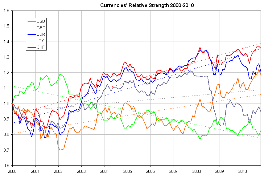
A first look over the past decade seems to illustrate some trends (click to enlarge):

The first 2 years show a pronounced strengthening of the USD, in the aftermath of the dot-com boom, but as of 2002 the USD has been declining steadily. The Federal Reserve Bank of Cleveland wrote an eloquent paper suggesting that the decline was due to the US current account deficit. This correlation held for a few years, but the USD continued to fall even when the account deficit started diminishing in 2006. I find it reassuring that the experts’ tea-leaves are no better at forex predictions than mine.

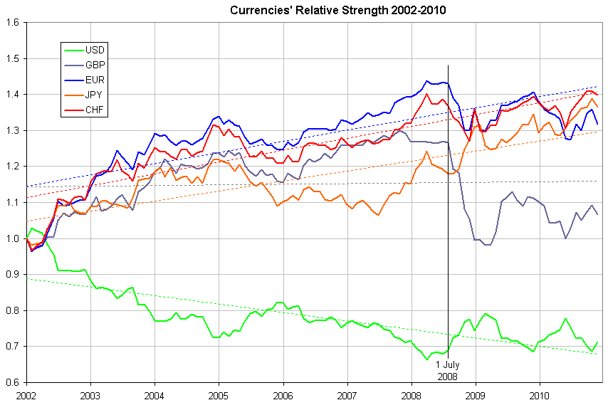
Moving on, if we set the starting point in 2002, the picture becomes much clearer:

Notice that the stock market crash of 2008 occurred on the 16th of September 2008, yet the currencies tumbled 6 weeks earlier. The documented mass buying of USD and JPY started then, not in September. I wonder why?

From 2002 to 2008, the EUR was clearly the strongest currency, even through the crash, and things remained relatively rosy until Greece admitted to cheating in its financial reporting and more than doubled its deficit in late 2009.  The Greeks were followed by the Irish, the Portugese, et al in a landslide where most of Europe had to own up to the vast borrowing over the past decade.

For the USD, its been downhill pretty well all the way. 2005 showed a slight rally, at least in part due to the Chinese severing the dollar peg mid-year. The second rally during the 2008 crisis was due solely to panic selling and Obama’s election in January 2009 created but a short-lived blip. Finally, the first half of 2010 saw the USD gaining some lost ground, but it was quickly reversed once the Fed starting printing money in earnest.

Returning to the glass of wine analogy, if in 2000 you held Swiss Francs, today you’d get a 136mL top-up; if you held US dollars, you’d only have 82mL in your glass. If you see the glass half-full, that’s a 60% loss; if you see it half-empty, it’s a 66% loss, either way it’s a huge difference.

My predictions

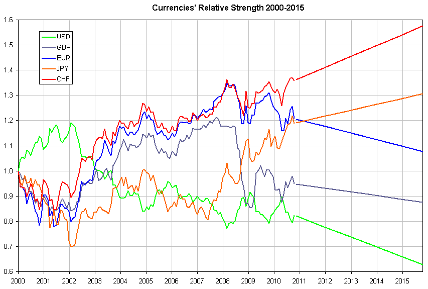
The Americans have chosen to get rid of their debt by devaluation. They don’t care, it’s not their loss. I’m very bearish and if the Chinese start selling their T-Bills in the not-so-distant future, the USD will become worthless overnight.

The Brits will take their medicine better than most, but the GBP will continue to lose value steadily for many years to come.

Europe will never really get its act together, simply because a single currency doesn’t make a single mentality. Issuing more and more bonds to buy back yesterday’s borrowing is just a stop-gap solution to delay the inevitable devaluation of the Euro.

The Japanese, industrious and disciplined, will grind on and climb steadily back to a comfortable position, exactly following the slope of the last decade.

For lack of a floating rate, it’s impossible to foresee how the Yuan will progress, but even cave-dwellers can see that it can only be upwards.

Finally, Switzerland, as usual, will remain a haven for both clean and slightly-soiled money. Their relations with their European neighbours will degrade (for a good part due to jealousy), and like the Yen, I predict that the CHF will continue on its current slope.

Graphically, here’s how I see the relative strengths:

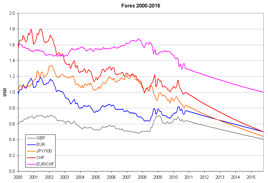
which in forex terms, looks like this:

In summary:

  • The GBP will fall more or less in step with the EUR
  • Near the end of 2012, we’ll see 100 JPY = 1 EUR
  • At the end of 2015, the big bang when 1 CHF = 2 USD = 2 EUR.

Remember, you read it here first.

Oct 202010
 

Addin for Microsoft Excel which allows you to perform forward and reverse geocoding, both by address and latitude / longitude, calculate Great Circle Distances using Vincenty’s algorithm, calculate travel distances and durations and verify the results with a Google Maps Task Pane, all inside your comfortable Excel interface.

This is useful for creating GoogleMap applications to find places from a list, like this.

Implements three Excel formulas:

=Geocode(request, location)

Request is the field to return:

  • status The status of the geocode request (Fetching, OK, N matches, etc.)
  • latitude The latitude of ‘location’
  • longitude The longitude of ‘location’
  • and so on: formatted_address, country political,administrative_area_level_1 political, administrative_area_level_2 political, administrative_area_level_3 political, locality political, sublocality political, route, street_number, postal_code, types, location_type, partial_match, point_of_interest, establishment, viewpointne, viewpointsw, airport establishment transit_station, bus_station transit_station, establishment, natural_feature, neighborhood political, postal_town, premise, street_address, subpremise

Location is the name or address of a place or point of interest

=GreatCircleDistance(latitude1, longitude1, latitude2, longitude2)

Calculates the Great Circle Distance using Vincenty’s Formula, with fallback to the Haversine formula when Vincenty’s method doesn’t converge.

=Travel(request, origin, destination, mode)

Calculates the distance or duration to get from origin to destination, according to Google Directions.

Request is the field to return:

  • distance The distance in metres from origin to destination
  • duration The estimated duration from origin to destination

Origin and destination are the names or addresses of the start and finish.

Mode is the mode of transport to use: Driving, Bicycling or Walking

Free download here

Enjoy!

Screenshot, click to enlarge:

May 112010
 

In the process of analysing a client’s existing database, I used Visio’s reverse-engineering tool. It works well, but the resulting diagram was an incomprehensible bowl of spaghetti. Visio does have a “Layout shapes” command, which appears to work by moving shapes with repulsive forces and the result is, not surprisingly, repulsive.

What I wanted was a tool which would unravel the spaghetti, so that I could get a grasp of the relationships, edit and revise them and layout again in an iterative process.
Searching for a solution, I found three layout programs, none of which have a Visio interface:

  1. Microsoft Automatic Graph Layout (MSAGL), formerly known as GLEE The first version, GLEE, is free whereas MSAGL costs between 99 USD and 279 USD depending on where you buy it.
  2. Tom Sawyer Layout is also a graph layout library, the price isn’t disclosed on their website.
  3. Graphviz from AT&T research labs, reputed to have the most sophisticated layout algorithms, is free.

Given that the best quality was to be found in the free library, I made the obvious choice.
It took me over a year and some 11’000 lines of VB to get Visio and Graphviz to co-exist; marrying a Unix-style command-line program with a WYSIWYG interface, both with quirks to numerous to mention, was far more challenging than I initially thought.
The result, unimaginatively called GraphVizio, is available here, I hope you’ll find it useful.

25 May 2011 Version 1.1.5 released. Improvements:

Full support for 64-bit Windows and Visio

No longer makes a Visio document ‘dirty’ when opening

Full support for UTF8. This DOT file:

graph  RootGraph {
  node [width="7.08661417322834", height="0.787401574803148", color="#000000", fillcolor="#FFFFFF", fontname=Calibri, fontsize=24, style=filled, shape=box];
  edge [color="#000000", fillcolor="#FFFFFF"];

  "English: Hello, my name is Maurice\n(and blame Google if the translations are bad)" [pos="283.704566929134,620.932913385827", label="English: Hello, my name is Maurice\n(and blame Google if the translations are bad)"];
  "Russian: Здравствуйте, меня зовут Морис" [pos="283.704566929134,526.932913385827", label="Russian: Здравствуйте, меня зовут Морис"];
  "مرحبا، اسمي موريس : Arabic" [pos="283.704566929134,432.932913385827", label="مرحبا، اسمي موريس : Arabic"];
  "Chinese: 你好,我叫莫里斯" [pos="283.704566929134,338.932913385827", label="Chinese: 你好,我叫莫里斯"];
  "שלום, שמי הוא מוריס : Hebrew" [pos="283.704566929134,244.932913385827", label="שלום, שמי הוא מוריס : Hebrew"];
  "Japanese: こんにちは、私の名前はモーリスです" [pos="283.704566929134,150.932913385826", label="Japanese: こんにちは、私の名前はモーリスです"];
  "Thai: สวัสดีชื่อของฉันคือ Maurice" [pos="283.704566929134,56.9329133858268", label="Thai: สวัสดีชื่อของฉันคือ Maurice"];

  "English: Hello, my name is Maurice\n(and blame Google if the translations are bad)"--"Russian: Здравствуйте, меня зовут Морис";
  "Russian: Здравствуйте, меня зовут Морис"--"مرحبا، اسمي موريس : Arabic";
  "مرحبا، اسمي موريس : Arabic"--"Chinese: 你好,我叫莫里斯";
  "Chinese: 你好,我叫莫里斯"--"שלום, שמי הוא מוריס : Hebrew";
  "שלום, שמי הוא מוריס : Hebrew"--"Japanese: こんにちは、私の名前はモーリスです";
  "Japanese: こんにちは、私の名前はモーリスです"--"Thai: สวัสดีชื่อของฉันคือ Maurice";
}

produces this Visio diagram:

Graphvizio UTF8