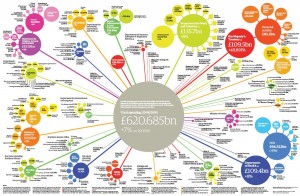
Pavel in St. Petersburg asked me if it would be possible to produce bubble diagrams like this in Excel:
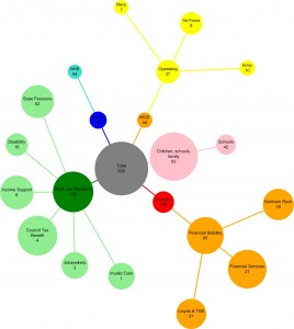
Excel has had bubble diagrams sine 2003 but they are just an X-Y plot with variable-sized nodes. What Pavel was after is an automatic layout, with lines joining the nodes, along these lines:
Not perfect, but you get the idea, and it’s produced automatically. To do this, you’ll need Excel, Visio, Graphvizio and this zip file which contains the sample XLS, GV, VSD and JPG files.
- Open the XLS. Column A is the node’s title, B is the title and the amount separated by a newline. Columns C, D and E specify the node’s parent, colour and amount. Column F computes the diameter of the node, in inches, from the amount:
Column G just creates Graphviz DOT statements from the values. G1 and G2 are the prelude. Copying column G into a text file called bubble1.gv, we get:
graph  RootGraph {
node [fontname=Arial, fontsize=12, style=filled];

"Total\n620" [width="3.1", height="3.1", color="gray", fillcolor="gray", shape=circle];

"Children, schools, family\n63"--"Total\n620" [color="pink"]; "Children, schools, family\n63" [width="0.315", height="0.315", color="pink", fillcolor="pink", shape=circle];

"Schools\n42"--"Children, schools, family\n63" [color="pink"]; "Schools\n42" [width="0.21", height="0.21", color="pink", fillcolor="pink", shape=circle];

...snip...

}
- Fire up Visio. Graph>Diagram->Import Graphviz
- To get the circular layout, Graph->Settings->Diagram->Concentric
- Graph->Layout
- A little tweaking of the font sizes and line thickness and you’re on your way
Enjoy!


